BOKL, today's cuisine that makes tomorrow good
- Food
- Brand strategy and advice
- Identity / Branding
A brand that makes you hungry and has the fangs.
The food we love jars
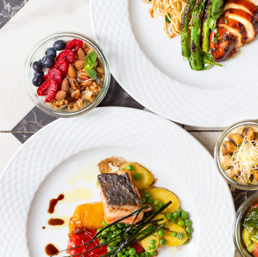
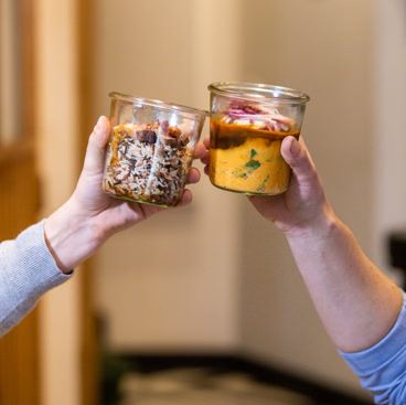
This is the story of two restaurateurs who launch homemade dishes in jars for lunch. A fresh initiative and zero waste, thanks to the deposit, which only needs an explosive identity to take its place in a local market saturated with supply.
A gourmet and civic pleasure
The midday meal is an individualistic action, led by tastes, value for money and ease of access. What if we complemented it with a community dimension: that of environmental commitment, the short circuit and zero-waste?
Learn to know you
Go beyond the description by analyzing your brand, your market, your customers and your competitors.
- VALUE PROPOSAL
Exploring potential
To find and delimit your playing field and speaking.
- TERRITORY OF EXPRESSION
Sharpen ideas
And keep only the sharpest.
- NAMING
- LOGO
- BASELINE
Embody the brand
To materialize its existence.
- EDITORIAL CHARTER
- GRAPHIC CHARTER
- WEBSITE
Naming
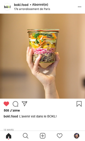
A resolutely modern concept and in tune with the times, the brand had to find a name as fresh as these recipes … while making a nod to the deposit system, belonging to the previous generation! We offer BOKL, in all capital letters, which marks with its distinct spelling that catches the eye. The pronunciation, “jar” echoes the brand’s iconic container, at the heart of its concept. The modern offer based on old-fashioned conservation has found a name that unites its two universes: finally a youth cuisine that appeals to our grandmothers!
Editorial charter
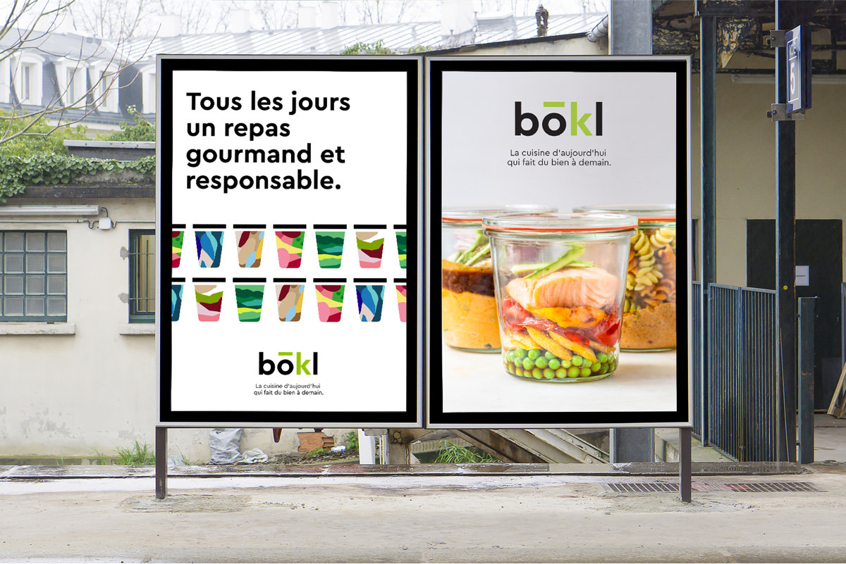
To seduce the general public in the midst of a plethora of catering offers, you need punchlines that aim correctly and that hit hard! Our bias: systematically bring together in each sentence organoleptic pleasure (gluttony, healthy and balanced recipes) and citizen pleasure (zero-waste, organic and local)! A powerful positioning embodied through a brand signature made in Sweet Punk:
Branding
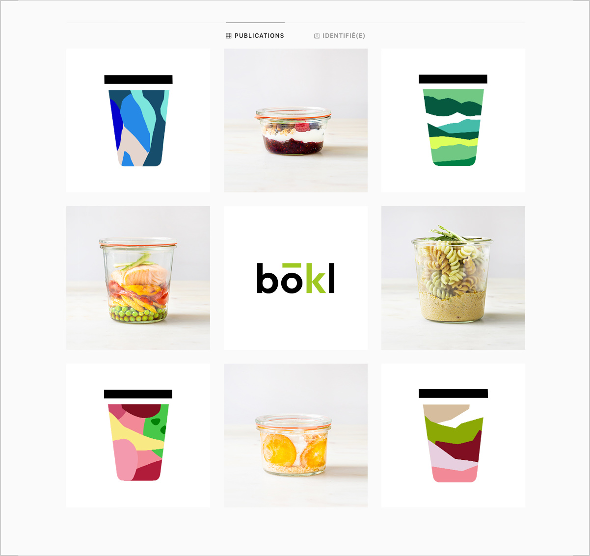
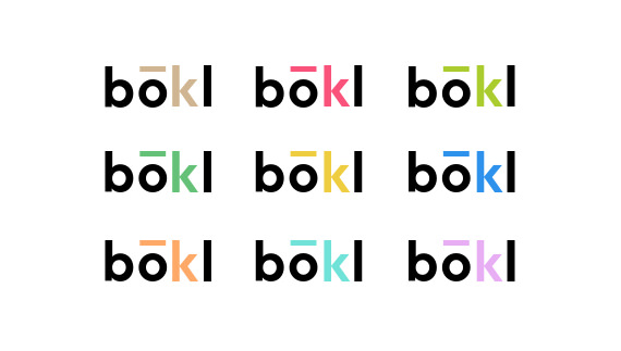
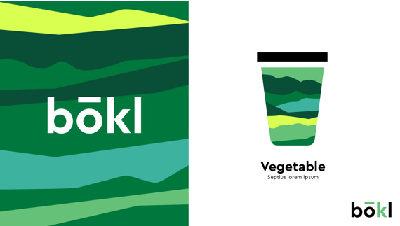
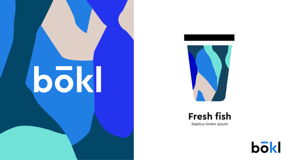
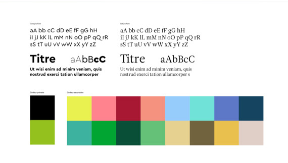
BOKL recipes are homemade, the logo must reflect this producer / consumer proximity. We opt for a craft and organic aspect, far from industrial codes. Pop and warm colors, enriched by abstract patterns, directly echo the products, which change according to taste and season.
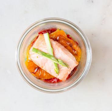
With glass jars, you are necessarily transparent.


