A new visual direction for Loon Plage
- Culture and sport
- Identity / Branding
An iconic identity for the French Motocross circuit
Boosting the most demanding course on the circuit
The Fédération Française de Motocyclisme, founded over 110 years ago, plays a leading role in the organisation and development of motorbike sport in France.
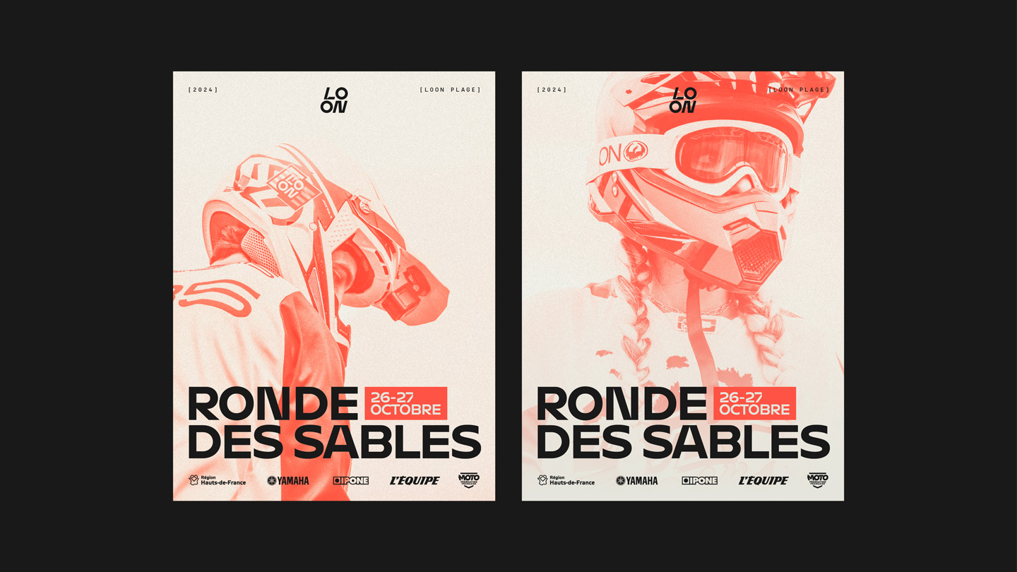
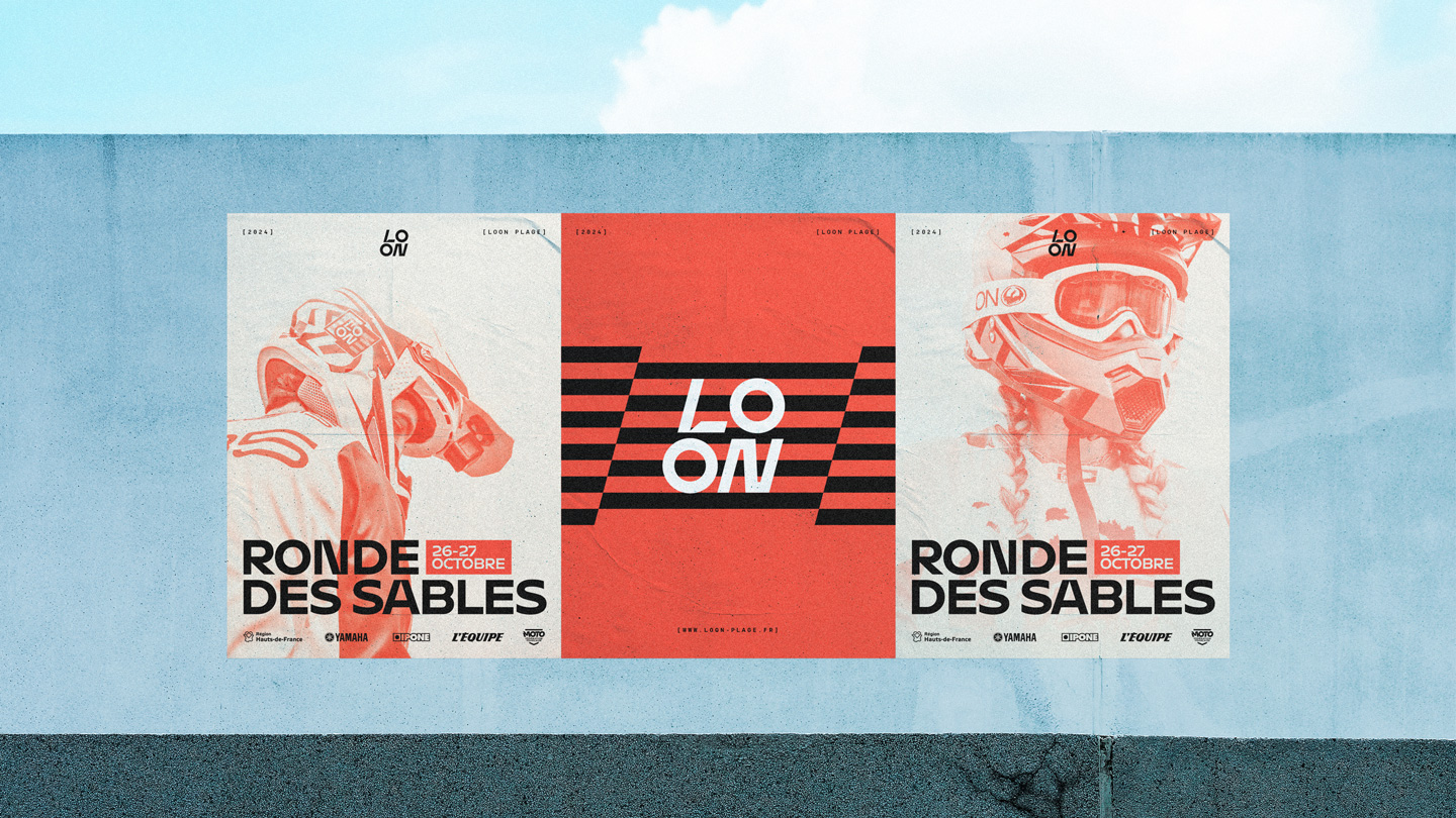
Now the owner of the legendary Loon Plage circuit, the FFM is keen to promote the circuit’s image through the creation of a new graphic charter.
This is part of the federation’s overall mission to promote motocross in France and make it more attractive.
The industrial heritage of the North as a starting point
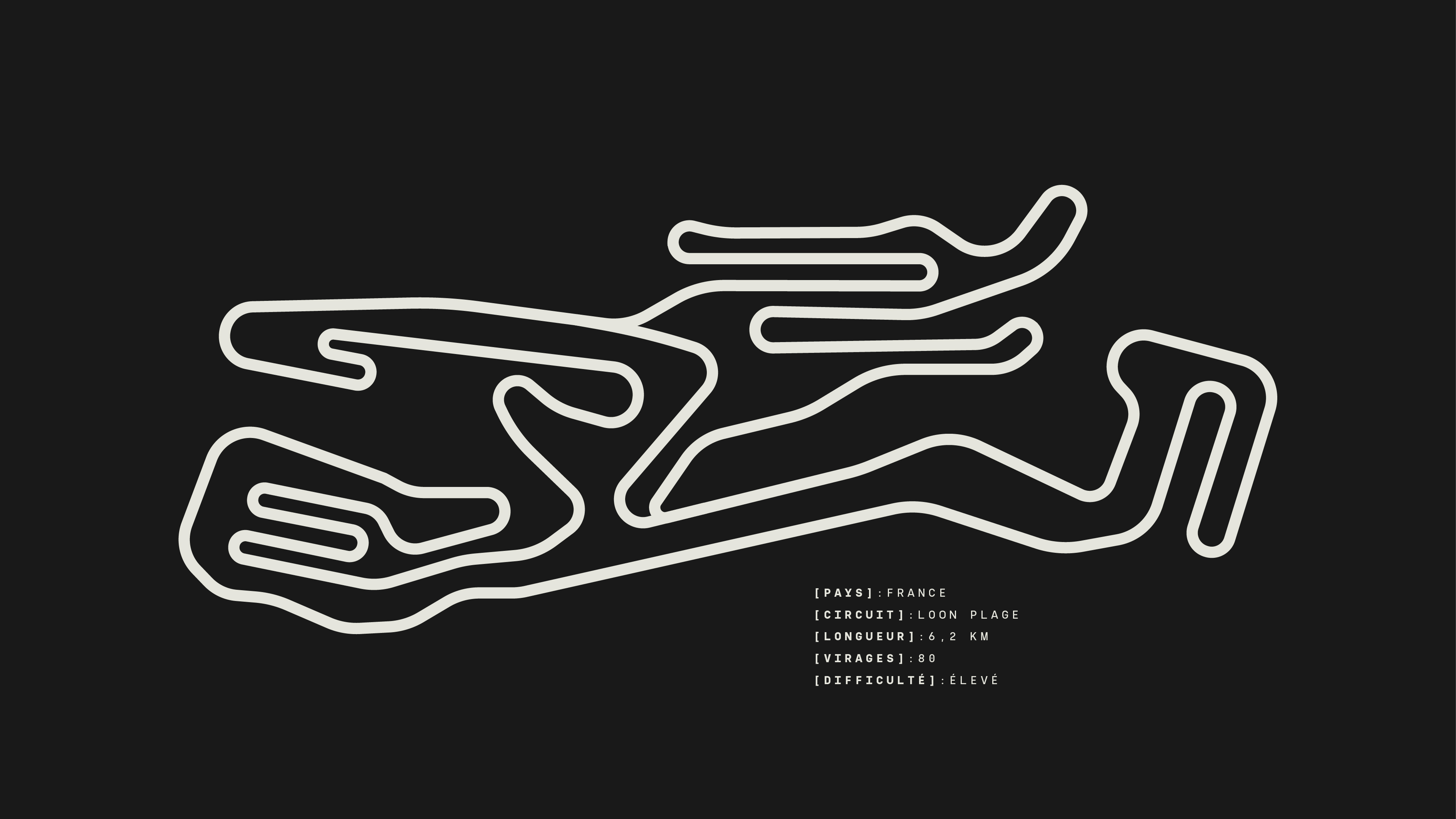
As well as the high standards demanded of the riders because of its sandy terrain and angular layout, the Loon Plage circuit is emblematic thanks to the industrial chimneys that can be seen when you stand at the top of the circuit dune.
It’s this heritage that we’ve chosen as a strategic starting point to make Loon Plage a marker of identity capable of uniting an entire region around shared values and motorbike sport.
Mechanic City
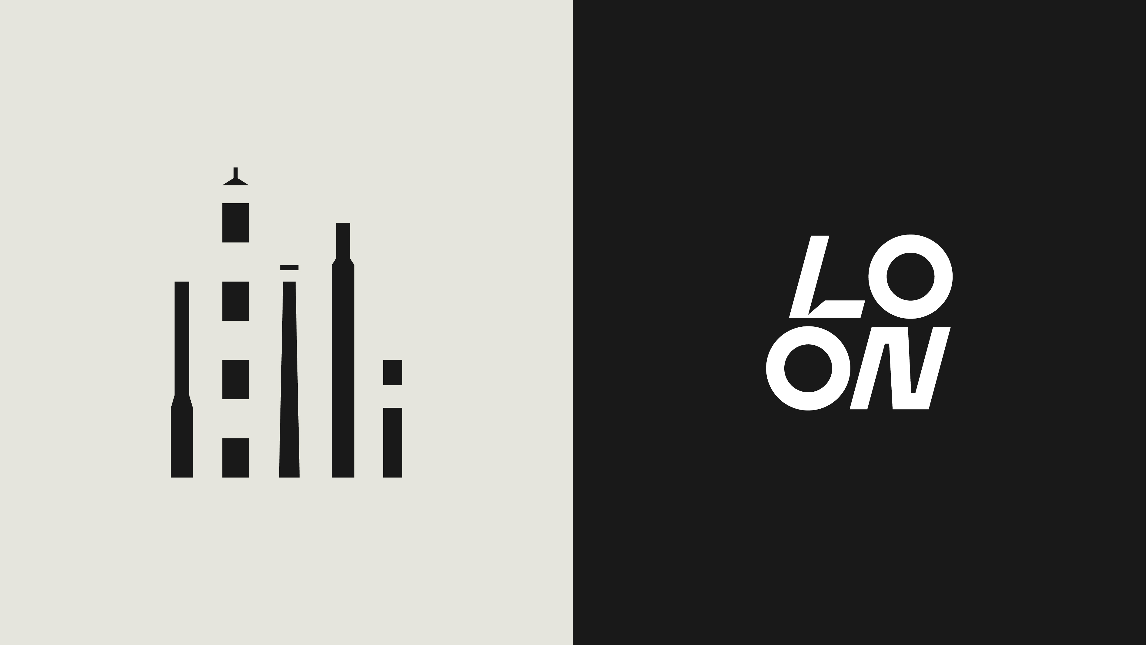
The smokestacks that can be seen from Loon Plage are a prominent feature of the landscape surrounding the circuit. In fact, 20% of Loon Plage is occupied by industry.
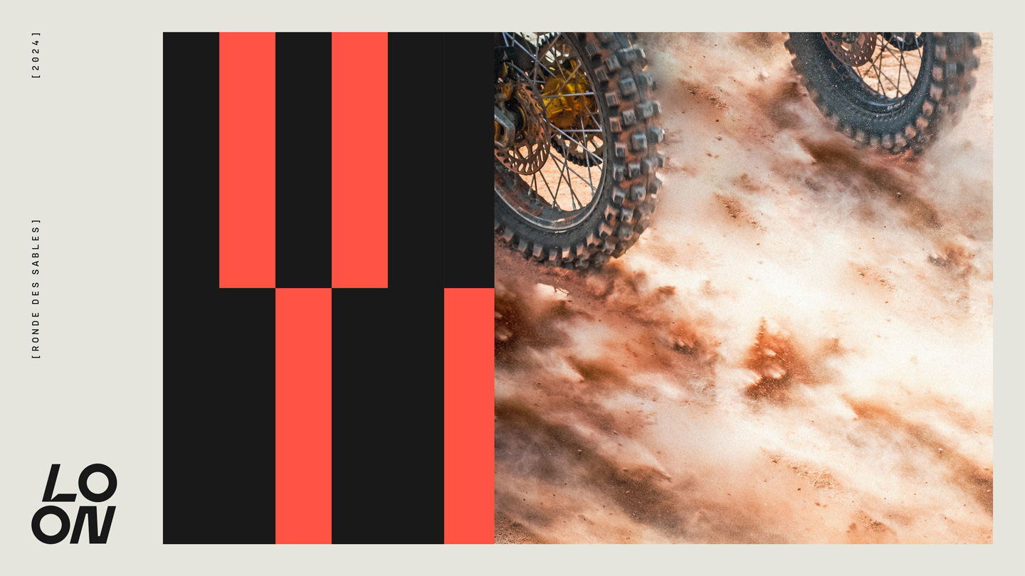
These different architectural elements of the industrial landscape have been given pride of place in the new visual identity of the Loon Plage circuit. Combining dynamism and heritage, they are transcribed through a geometric and striking graphic territory.
Our guidance
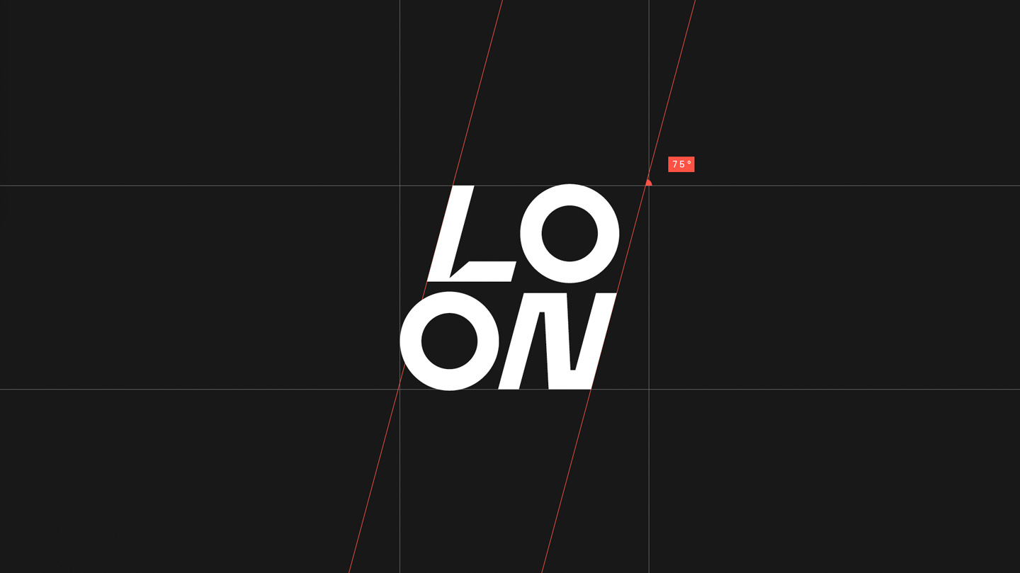
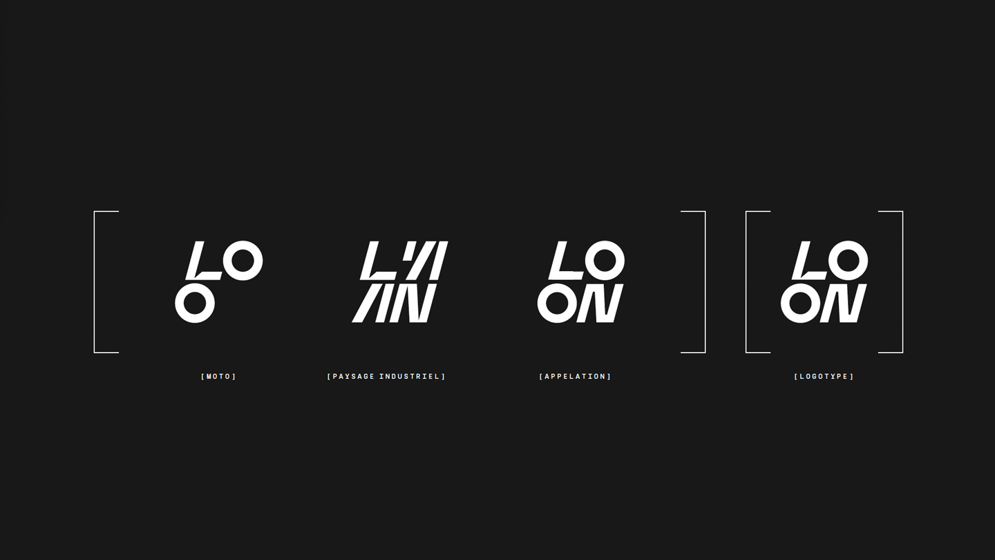
Through its construction and design, the logotype of the Loon Plage circuit reflects several aspects of the site and its special features.
First of all, the name is unique and familiar to all: LOON. The name has been shortened to increase its impact and become a strong marker in the enduro world. It’s also a nod to all the fans of the area, for whom this name is a unanimous favourite.
The composition of this new logo also subtly integrates the user at the heart of the characters. The arrangement of the letters ‘L’ and ‘O’ illustrates a motorcyclist in action, jumping over one of the bumps on the circuit.
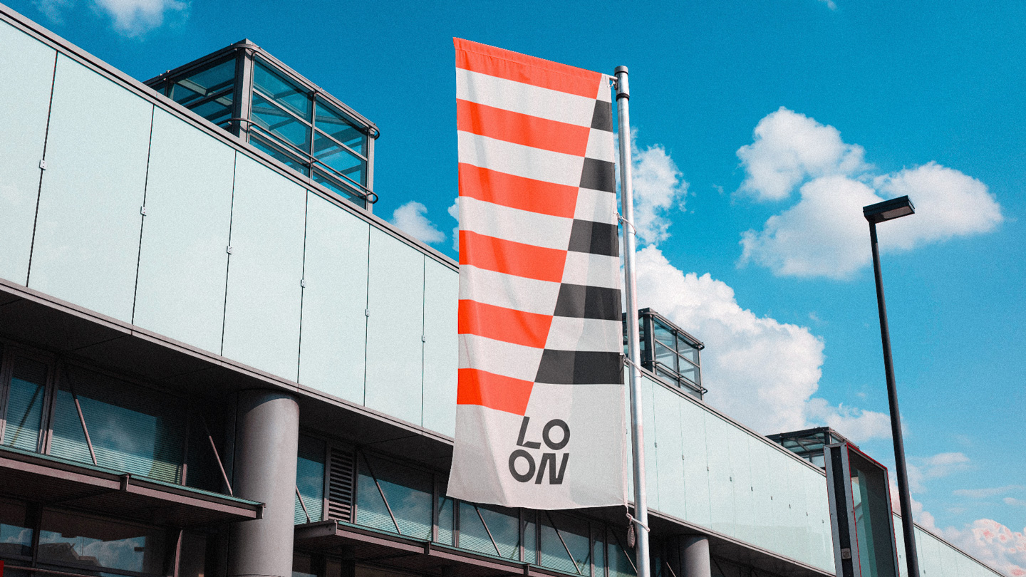
Finally, the logotype is built on two lines to evoke the industrial landscape of Loon Plage. The superimposition of the characters creates a graphic motif, reminiscent of the famous chimneys, by repeating the vertical lines of the characters.
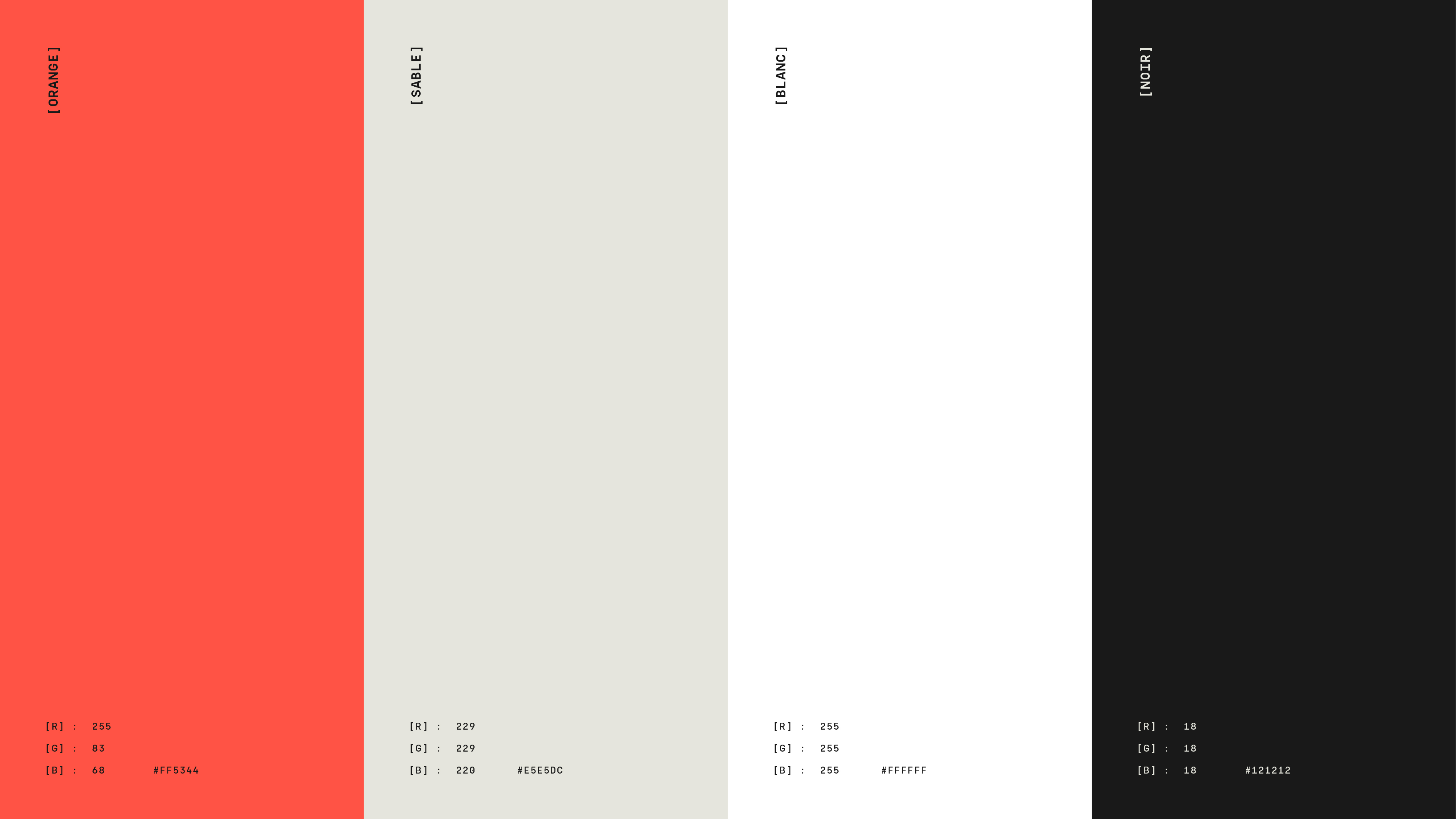
The colour palette of the new identity is based on three distinctive hues.
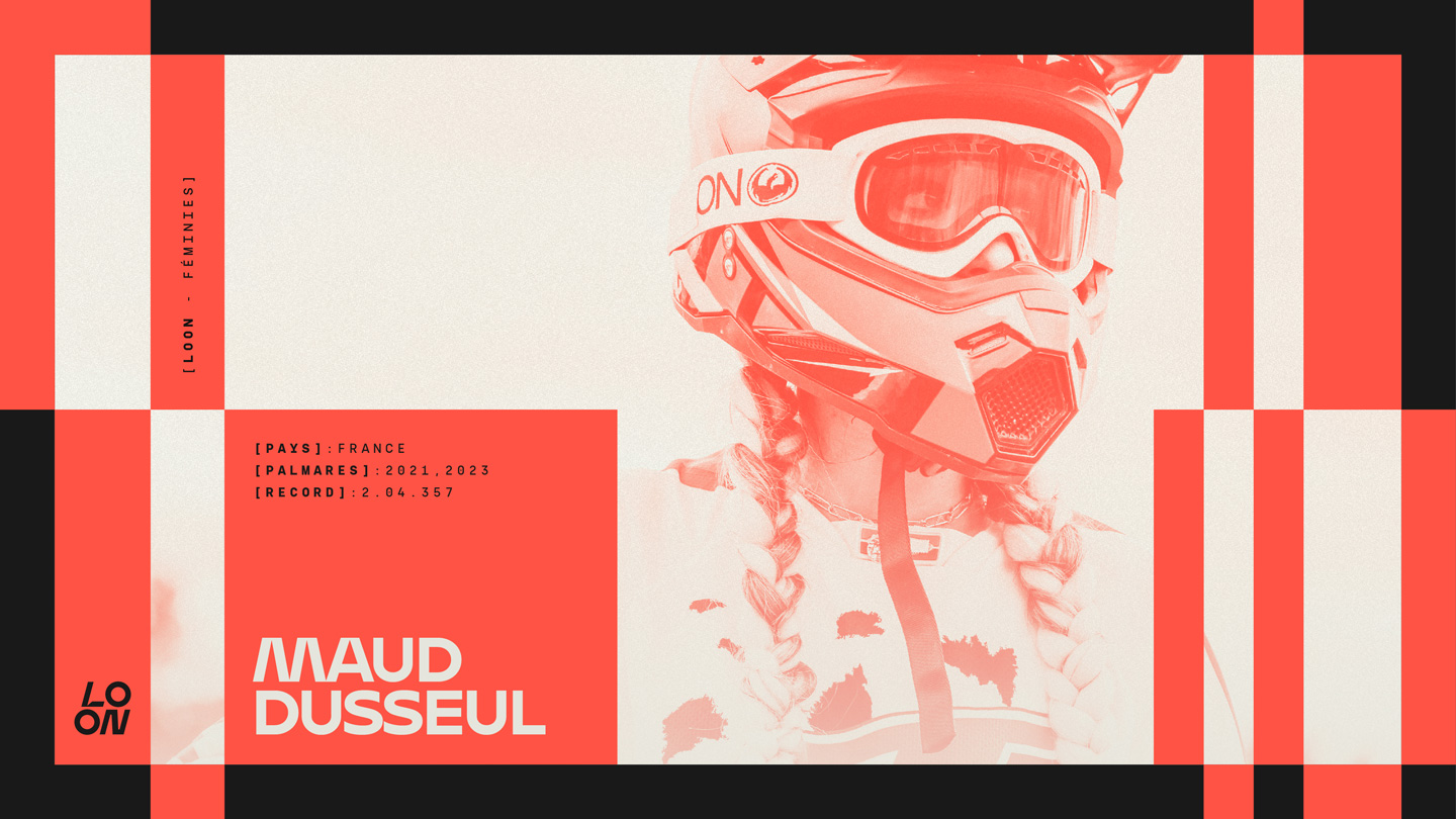
The first is orange. This is a tribute to the Hauts de France region, and more specifically to brick. It’s also a widespread colour in the motocross world, often associated with challenge and thrills.
The second colour is sand. It illustrates the specificity of this circuit and its unique surface.
Finally, the colour black adds a technical and mechanical dimension to this new identity, which is dear to the hearts of tens of thousands of fans of this sport.
